Financial Data Visualization - Amounts
This article is part of financial data visualization series where we cover most prominent plots used to quickly comprehend thousands or even millions of data points to support decision-making in finance. In this article, we dive deeper into visualizing amounts in finance.
Although, both can be used to visualize numeric data; the purpose is a lot different. The purpose of visualizing amounts is to compare magnitude of discrete numeric data over time or any other categorical variable. Bar plots and Line plots are excellent ways to visualize amounts. The length of the bar is proportional to the magnitude of the discrete numeric variable.
In this article, we cover some of the more common visualizations used to represent amounts (i.e. magnitude of the quantitative values)
1. Bar Charts
2. Diverging Bar Charts
3. Stacked Bar Charts
4. Grouped Bar Charts (also called Clustered Bar Charts)
5. Animated Bar Charts
6. Dot Plots (also called Cleveland Dot Charts)
7. Bubble Charts
8. Heatmaps
Others include :
9. Waterfall Charts
10. Polar Area Charts (also called Coxcomb Charts)
11. Dumbbell Charts
We will be using quandl api and quantmod api to import financial data. Using an API for importing data is beneficial, especially in finance, because the dataset is updated extremely frequently, and they offer a lot of benefits in terms of ease and flexibility.
We can install quandl & quantmod packages and register an account on quandl.com
Create a free Quandl account and set your API key here
For more information, refer to the link below :
https://www.quandl.com/tools/r
# Run the script below with your secret key obtained after registering on quandl
# quandl_sk = "<quandl secret key>"

# Alternative way to Load Data Tokens
source("../R/Setup/apitokens.r")

# Data manipulation libraries used in this notebook
library(tibble) # includes rownames_to_column function
library(dplyr) # includes filter function
library(tidyr) # includes spread function

# Visualization libraries used in this notebook
library(ggplot2) # Includes ggplot function
library(ggforce) # Includes geom_sina & geom_parallel_sets
library(ggridges) # Includes geom_
library(cowplot) # Includes axis_canvas for generating A Canvas Onto Which One Can Draw Axis-Like Objects

# Data API libraries
library(Quandl) # To import data from Quandl API
library(quantmod) # To import data using yahoo,google api

# Animation Packages
library(gganimate) # to add animation to static plot
library(gifski) # Converts images to GIF animations
library(png) # Provides an easy and simple way to read, write and display bitmap images stored in the PNG format.

# Datetime Parsing functions
library(lubridate) # includes datetime parsing functions

# Data visualization addon library for Themes and colors available in my github repository
# https://github.com/prabhupavitra/dviz.addon
library(dviz.addon)

# Resizing plot width and height from default 7
# https://www.rdocumentation.org/packages/repr/versions/0.7/topics/repr-options
options(repr.plot.width=10, repr.plot.height=4)
Importing Data (Using Quandl and quantmod API)
This notebook uses Quandl and quantmod API to import Financial Data directly to R.
Datasets used in this notebook include:
1. Historical Prices of Precious Metals (Gold, Silver, Platinum and Palladium)
2. Historical Prices of Non-Ferrous Base Metals (Aluminum; Copper; Lead; Nickel; Tin and Zinc)
3. Consumer Price Index for All Urban Consumers (CPI-U)
Precious Metals Prices : London Fixing (U.S. Dollars per Troy Ounce)
# Using Quandl API : Import prices of Precious Metals ( Gold, Silver, Platinum, Palladium )

# Gold Price: London Fixing
gold <- Quandl("LBMA/GOLD", api_key=quandl_sk)

# Silver Price: London Fixing
silver <- Quandl("LBMA/SILVER", api_key=quandl_sk)

# Platinum Fixing
platinum <- Quandl("LPPM/PLAT", api_key=quandl_sk)

# Palladium
palladium <- Quandl("LPPM/PALL", api_key=quandl_sk)
Base Metals Prices : Spot Prices (U.S. Dollars per metric ton)
# Other Base Metals (Aluminum; Cobalt; Copper; Iron Ore; Lead; Molybdenum; Nickel; Tin; Uranium and Zinc)

# Aluminum; 99.5% minimum purity; LME spot price; CIF UK ports; US$ per metric ton
aluminium <- Quandl("ODA/PALUM_USD", api_key=quandl_sk)

# Copper; grade A cathode; LME spot price; CIF European ports; US$ per metric ton
copper <- Quandl("ODA/PCOPP_USD", api_key=quandl_sk)

# Lead; 99.97% pure; LME spot price; CIF European Ports; US$ per metric ton
lead <- Quandl("ODA/PLEAD_USD", api_key=quandl_sk)

# Nickel; melting grade; LME spot price; CIF European ports; US$ per metric ton
nickel <- Quandl("ODA/PNICK_USD", api_key=quandl_sk)

# Tin; standard grade; LME spot price; US$ per metric ton
tin <- Quandl("ODA/PTIN_USD", api_key=quandl_sk)

# Zinc; high grade 98% pure; US$ per metric ton
zinc <- Quandl("ODA/PZINC_USD", api_key=quandl_sk)
CPI Data : CPI for U.S. City Average (Units: Index 1982-1984=100, Seasonally Adjusted ; Frequency: Monthly)
# Consumer Price Index for All Urban Consumers: All Items in U.S. City Average
monthly_allitems <- Quandl("FRED/CPIAUCSL", api_key=quandl_sk)

# Consumer Price Index for All Urban Consumers: Food and Beverages in U.S. City Average
monthly_foodbev <- Quandl("FRED/CPIFABSL", api_key=quandl_sk)

# Consumer Price Index for All Urban Consumers: All Items Less Food and Energy in U.S. City Average
monthly_excfoodnbev <- Quandl("FRED/CPILFESL", api_key=quandl_sk)

# Consumer Price Index for All Urban Consumers: Recreation in U.S. City Average
monthly_recreation <- Quandl("FRED/CPIRECSL", api_key=quandl_sk)

# Consumer Price Index for All Urban Consumers: Housing in U.S. City Average
monthly_housing <- Quandl("FRED/CPIHOSNS", api_key=quandl_sk)

# Consumer Price Index for All Urban Consumers: Education and Communication in U.S. City Average
monthly_eduncomm <- Quandl("FRED/CPIEDUSL", api_key=quandl_sk)

# Consumer Price Index for All Urban Consumers: Apparel in U.S. City Average
monthly_apparel <- Quandl("FRED/CPIAPPSL", api_key=quandl_sk)

# Consumer Price Index for All Urban Consumers: Energy in U.S. City Average
monthly_energy <- Quandl("FRED/CPIENGSL", api_key=quandl_sk)

# Consumer Price Index for All Urban Consumers: Other Goods and Services in U.S. City Average
monthly_othergns <- Quandl("FRED/CPIOGSSL", api_key=quandl_sk)

# Consumer Price Index for All Urban Consumers: Transportation in U.S. City Average
monthly_trnsprt <- Quandl("FRED/CPITRNSL", api_key=quandl_sk)

# Consumer Price Index for All Urban Consumers: Services in U.S. City Average
monthly_otherserv <- Quandl("FRED/CUSR0000SAS", api_key=quandl_sk)

# Consumer Price Index for All Urban Consumers: Commodities in U.S. City Average
monthly_commod <- Quandl("FRED/CUSR0000SAC", api_key=quandl_sk)

# Consumer Price Index for All Urban Consumers: Medical Care in U.S. City Average
monthly_medcare <- Quandl("FRED/CPIMEDSL", api_key=quandl_sk)
Data Preparation
Precious Metals Prices : London Fixing (U.S. Dollars per Troy Ounce)
# Merging the datasets of all 4 precious metals (Measured per Troy Ounce)
precious_metals <-
rbind(gold %>% select("Date","USD (AM)") %>% rename(USD="USD (AM)") %>% mutate(Commodity="Gold"),
silver %>% select("Date","USD") %>% mutate(Commodity="Silver"),
platinum %>% select("Date","USD AM") %>% rename(USD="USD AM") %>% mutate(Commodity="Platinum"),
palladium %>% select("Date","USD AM") %>% rename(USD="USD AM") %>% mutate(Commodity="Palladium")) %>%
mutate(Year = year(Date)) %>% filter(USD!="NA")

head(precious_metals,5)
Base Metals Prices : Spot Prices (U.S. Dollars per metric ton)
base_metals <-
rbind(aluminium %>% mutate(Commodity="Aluminium"),
      copper %>% mutate(Commodity="Copper"),
      lead %>% mutate(Commodity="Lead"),
      nickel %>% mutate(Commodity="Nickel"),
      tin %>% mutate(Commodity="Tin"),
      zinc %>% mutate(Commodity="Zinc")) %>%
mutate(Year = year(Date))

head(base_metals,1)
CPI Data : CPI for U.S. City Average
cpi_monthly_sa <-
rbind(monthly_allitems %>% mutate(Category="CPI"),
      monthly_excfoodnbev %>% mutate(Category="Core CPI"),
      monthly_apparel %>% mutate(Category="Apparel"),
      monthly_commod %>% mutate(Category="Commodities"),
      monthly_eduncomm %>% mutate(Category="Education & Communication"),
      monthly_energy %>% mutate(Category="Energy"),
      monthly_foodbev %>% mutate(Category="Food & Beverages"),
      monthly_housing %>% mutate(Category="Housing"),
      monthly_medcare %>% mutate(Category="Medical Care"),
      monthly_othergns %>% mutate(Category="Other Goods & Services"),
      monthly_otherserv %>% mutate(Category="Other Services"),
      monthly_recreation %>% mutate(Category="Recreation"),
      monthly_trnsprt %>% mutate(Category="Transportation")) %>%
mutate (Year =year(Date),Month=month(Date))

head(cpi_monthly_sa,1)
Before we proceed with visualizations, we will calculate some commonly used CPI metrics
# Percent Change (1982-Present)
cpi_pctchng <- filter(cpi_monthly_sa,#Month==1,
                                     Year>1982,
                                     !(Category %in% c('Energy','Transport'))) %>%
               group_by(Category) %>%
               arrange(Date) %>%
               mutate(PercentChange = (Value/lag(Value)-1)*100) %>%
               filter(PercentChange!="NA")

# Over-the-year percent change
cpi_otypct <-
cpi_monthly_sa %>%
filter(Year>1982,Month==12) %>%
arrange(Date) %>%
group_by(Category) %>%
mutate(OverYrPercentChange = (Value/lag(Value)-1)*100) %>%
filter(OverYrPercentChange!="NA")


# Annual Average, Annual Average CHange and Purchasing Power
cpi_annualavg <-
cpi_monthly_sa %>% filter(Year>1982,Year<2020) %>%
arrange(Date) %>%
group_by(Year,Category) %>%
summarise(AnnualAvg = mean(Value)) %>%
group_by(Category) %>%
mutate(AnnualAvgChange = (AnnualAvg/lag(AnnualAvg)-1)*100,
       PurchasingPower = (AnnualAvg/lag(AnnualAvg)*100)) %>%
filter(AnnualAvgChange!="NA")
Bar Charts
A simple way to visualize the quantitative data of a categorical variable is the bar chart. The height of the bar is proportional to the quantity we want to visualize. They can be used for displaying data that are classified as nominal data/ordinal data.
They are one of the most commonly used types of plots because they are simple to create and very easy to interpret. They are also a flexible chart type and there are several variations of the standard bar chart.
Most commonly used bar charts include:
- Horizontal bar charts
- Diverging bar charts
- Grouped or Component charts
- Stacked bar charts
- Animated bar charts
We will go through each one of these bar charts to get a sense of efficacy bar charts have in visualizing amounts. We will use CPI data for plotting horizontal, diverging and animated bar charts and metal prices for the others.
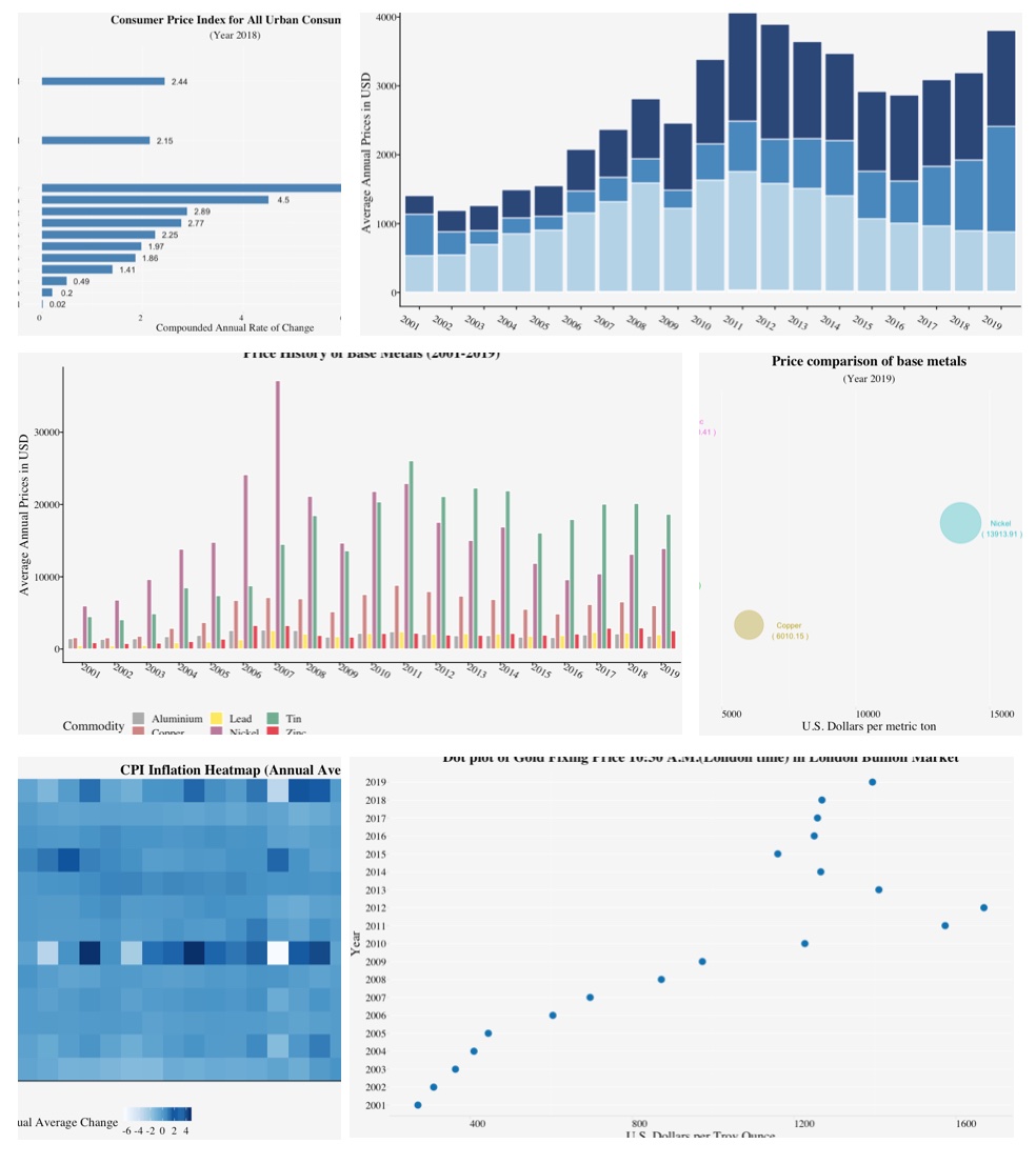
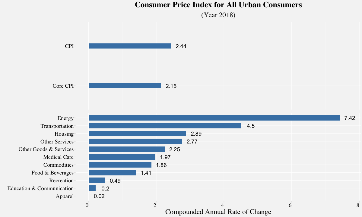
Horizontal bar chart
# Resizing the plot
options(repr.plot.width=10, repr.plot.height=6)

# Subset of Consumer Price Index for All Urban Consumers for the year 2018
df_barplot_categories <- filter(cpi_annualavg,
                                Year==2018,
                                !Category %in% c('CPI','Core CPI')) %>%
                         mutate(plotorder = 1)

df_barplot_all <- filter(cpi_annualavg,
                         Year==2018,
                         Category %in% c('CPI','Core CPI')) %>%
                  mutate(plotorder = 0)

# Plotting the bar plot
barplot_cpi <-
 ggplot(size=20) +
 geom_bar(data=df_barplot_categories,
           aes(x=reorder(Category,AnnualAvgChange),
           y=AnnualAvgChange),
          stat="identity",
          width= 0.7,
          fill="steelblue") +
 geom_bar(data = df_barplot_all,
            aes(x = reorder(Category,plotorder),y=AnnualAvgChange),
            stat="identity",
            width=0.125,
            fill="steelblue") +
 geom_text(data=df_barplot_categories,
           aes(x=reorder(Category,AnnualAvgChange),
               y=(AnnualAvgChange+ 0.25 * sign(AnnualAvgChange)),
           label =paste(" ",round(AnnualAvgChange,2))),
           hjust=0.5) +
 geom_text(data=df_barplot_all,
           aes(x = reorder(Category,plotorder),
               y= (AnnualAvgChange+ 0.25 *sign(AnnualAvgChange)),
           label =paste(" ",round(AnnualAvgChange,2))),
           hjust=0.5) +
 theme_pprabhu_grid() +
 labs(title = "Consumer Price Index for All Urban Consumers",
      subtitle="(Year 2018)",
      x="",
      y="Compounded Annual Rate of Change") +
 coord_flip() +
 theme(plot.title = element_text(hjust = 0.5),
       plot.subtitle = element_text(hjust = 0.5,size=14),
       axis.text.x = element_text(angle=0,hjust = 1),
       strip.text.x = element_blank())  +
 facet_wrap(.~plotorder, nrow = 2,scales="free_y",shrink = FALSE)


barplot_cpi
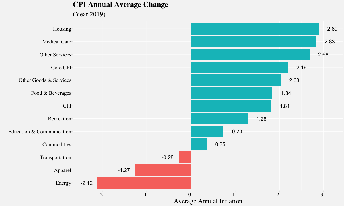
Diverging bar chart
A diverging bar chart is a bar chart with a diverging aspect; i.e. It makes comparison of amounts from a divergent line easy to visualize. This divergent line can represent zero, but it can also be used to simply separate the two distinguishing members of the dataset based on the amount.In the plot depicted below, the divergent line is zero; Its quite easier to visualize which Categories saw a positive rate of inflation vs negative.
# Diverging bar plot
cpi_annual <- cpi_annualavg %>% filter(Year==2019)

# Plotting the diverging bar plot
barplot_cpiannual <-
ggplot(cpi_annual,
       aes(x=reorder(Category,AnnualAvgChange),
           y=AnnualAvgChange,
           fill = AnnualAvgChange>0))+
  geom_bar(stat="identity")+
  geom_text(aes(x=reorder(Category,AnnualAvgChange),
                y=(AnnualAvgChange+ 0.28 * sign(AnnualAvgChange)),
            label =paste(" ",round(AnnualAvgChange,2))),
            hjust=0.5) +
  labs(x="",
       y="Average Annual Inflation",
       title ="CPI Annual Average Change",
       subtitle="(Year 2019)") +
  theme_pprabhu_grid() +
  coord_flip() +
  theme(plot.subtitle = element_text(size=14),
        axis.text.x = element_text(angle = 0, hjust = 1)) +
  guides(fill = FALSE)

barplot_cpiannual
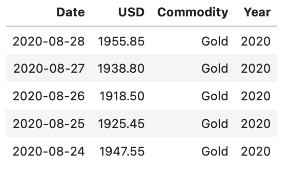
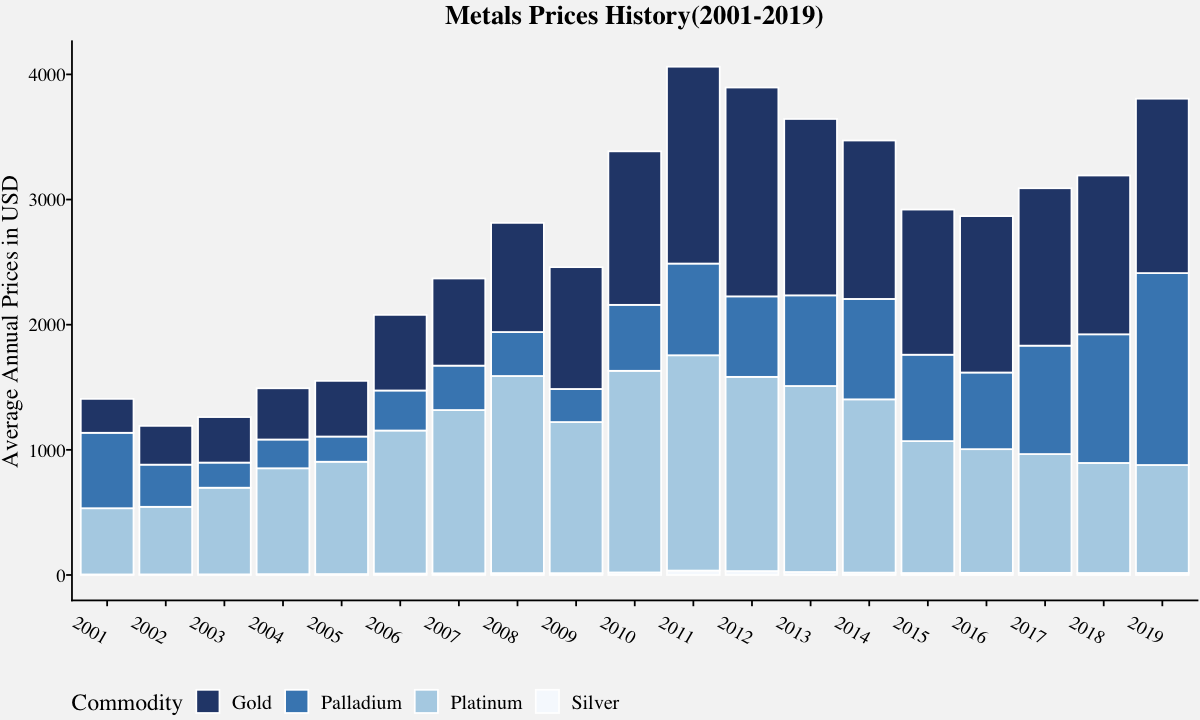
Stacked bar chart
The stacked bar chart extends the standard bar chart from visualizing quantity of one categorical variable to two. Each bar in a standard bar chart is divided into a number of sub-bars stacked end to end, each one corresponding to a level of the second categorical variable. The main objective of a standard bar chart is to compare numeric values between levels of a categorical variable. It also visualizes relative decomposition of each of the categories.
The stacked bar chart below depicts historical annual prices of precious metals. The two categorical variables: Commodity and Year. The primary categorical variable is the Commodity. It also depicts the relative decomposition of each of the commodities. For example, we can compare prices of 2018 vs 2019 in the stacked bar chart and infer that although the prices of gold, platinum and silver were steady, the palladium prices have risen considerably.
# Annual Metal prices (Includes Gold, Silver, Platinum and Palladium)
metals_stacked <-  filter(precious_metals,!is.na(USD),Year<2020,Year>2000) %>%
                   group_by(Year,Commodity) %>%
                   summarise(AnnualPrice = round(mean(USD),2))

# Plot the stacked barplot using geom_bar()
metals_stackedplot <-
ggplot(data=metals_stacked,
       aes(x=factor(Year),
           y=AnnualPrice,
           fill=Commodity)) +
       geom_bar(stat="identity",
                color="white",
                alpha=0.9) +
       labs(x="",y="Average Annual Prices in USD") +
       ggtitle("Metals Prices History(2001-2019)") +
       theme_pprabhu() +
       theme(plot.title = element_text(hjust = 0.5),
            axis.text.x = element_text(hjust = 1)) +
       scale_fill_pprabhu(palette = "sseq",discrete=TRUE)

metals_stackedplot
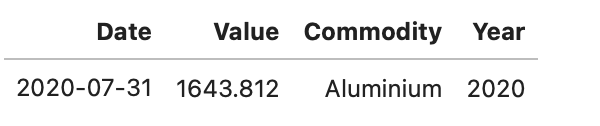
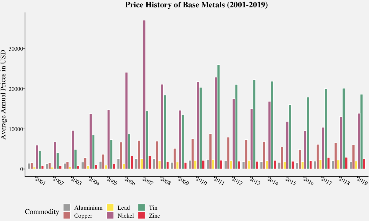
Grouped bar chart
The grouped bar chart, also known as clustered bar graph, multi-set bar chart, or grouped column chart is a variation of bar chart used when we need to visualize distribution of data points or making comparisons across different categories of data.
They are used when you want to do within-group and between-group comparisons in one single plot. For example, in the plot below, we can check the price comparisons of base metals within each year as well as over a period of time.
# Grouped Bar plot using geom_bar()
metals_grouped <-  filter(base_metals,!is.na(Value),Year<2020,Year>2000) %>%
                   group_by(Year,Commodity) %>%
                   summarise(AnnualPrice = round(mean(Value),2))

metals_groupedplot <-
ggplot(data=metals_grouped, aes(x=factor(Year),
                                y=AnnualPrice,
                                fill=Commodity)) +
       geom_bar(stat="identity",
                position=position_dodge(),
                alpha=0.8,
                color="white") +
       labs(x="",y="Average Annual Prices in USD") +
       ggtitle("Price History of Base Metals (2001-2019)") +
       scale_fill_pprabhu(palette = "qual") +
       theme_pprabhu() +
       theme(plot.title = element_text(hjust = 0.5))

metals_groupedplot
Animated bar chart
Animated bar charts are mostly used for visualization of trends over time. They provide a holistic data story/insight in a concise and easy to understand chart, which makes them more popular in social media.
# Creating a Animated Bar Chart using ggplot and geom_tile
cpi_input_format <-
cpi_annualavg %>%
group_by(Year)%>%
mutate(rank = rank(-AnnualAvgChange),
       Value_rel = AnnualAvgChange/AnnualAvgChange[rank==1],
       Value_lbl = paste0(" ",round(AnnualAvgChange,2))) %>%
group_by(Category) %>%
filter(rank <= 10)

# Creates images for every year
anim <-
ggplot(cpi_input_format,
       aes(rank, group = Category))+
  geom_tile(aes(y = AnnualAvgChange/2,
                height = AnnualAvgChange,
                fill = AnnualAvgChange>0,
                width = 0.9), alpha = 0.8) +
  geom_text(aes(y =sign(AnnualAvgChange)-4,
                label = paste(Category, " ")),
            vjust = 0.2,
            hjust = 1,
            size=7) +
  geom_text(aes(y=(AnnualAvgChange+ 0.45 * sign(AnnualAvgChange)),
            label =paste(" ",round(AnnualAvgChange,2))),
            hjust=0.5,
            size=7) +
  coord_flip(clip = "off",
             expand = TRUE) +
  scale_x_reverse() +
  theme_pprabhu() +
  theme(legend.position="none",
        plot.margin = margin(1,4, 1, 8, "cm"),
        axis.line=element_blank(),
        axis.text.x=element_blank(),
        axis.text.y=element_blank(),
        axis.title.x=element_blank(),
        axis.title.y=element_blank()) +
  transition_states(Year, transition_length = 4, state_length = 1) +
  ease_aes('cubic-in-out') + # For a smoother look
  labs(title = 'CPI Annual Average by Category: {closest_state}')

# Stores the gif_image object in the working directory
animate(anim, nframes = 350,
              fps = 15,
              width = 1200,
              height = 1000,
              renderer = gifski_renderer("gganim.gif"))

# This line inserts the image inline
IRdisplay::display_png(file = "gganim.gif")

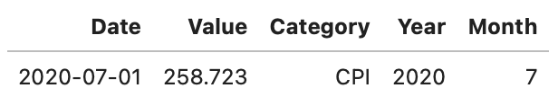
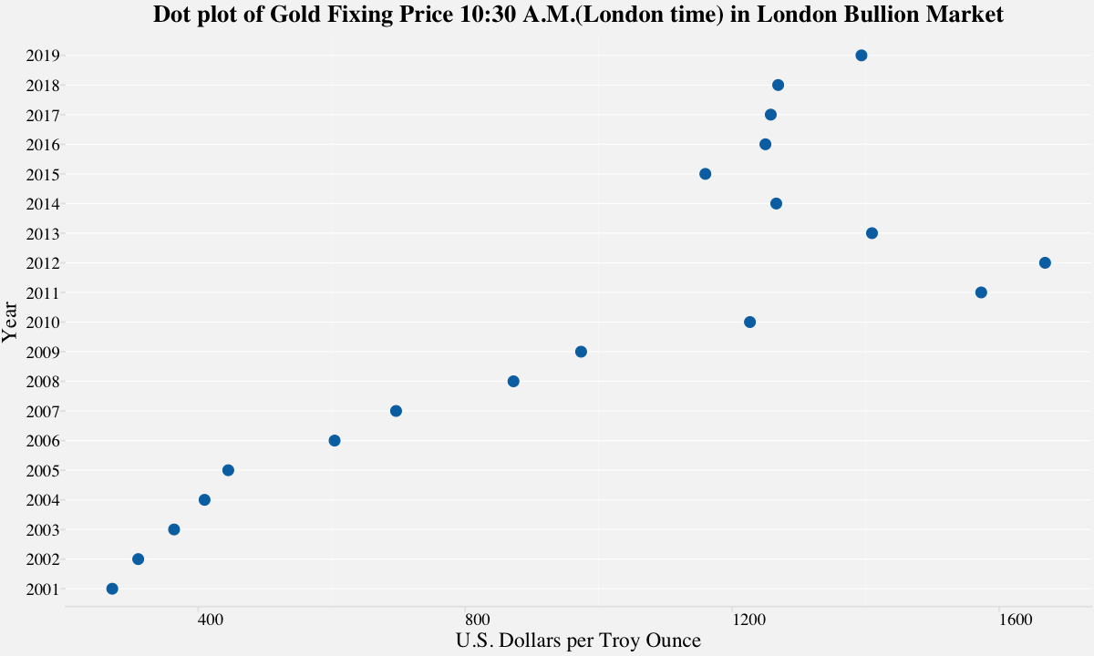
Cleveland Dot Plots
Dot plots are one of the simplest way to visualize single numerical variable with a modest number of observations. Cleveland dot plots refer to plots of points that each belong to one of several categories. They are an alternative to bar charts or pie charts, and look somewhat like a horizontal bar chart where the bars are replaced by a dots at the values associated with each category. They are a great alternative to the bar chart and the power of these plots becomes evident on refining and they can easily communicate important aspects of your data to viewers. In the example below, we have considered depicting Gold fixing price. Although this is a simple and basic case of dot plot, they are capable of depicting lot more information.
dotplot_data <- filter(precious_metals,Commodity=="Gold",!is.na(USD),
                       Year<2020,
                       Year>2000) %>%
                group_by(Year) %>%
                summarise(AnnualPrice = mean(USD))

# Dot plot using geom_point()
gold_dotplot <-
ggplot(data=dotplot_data,
       aes(x = as.character(Year),y=AnnualPrice)) +
       geom_point(color = "#0072B2", size = 3) +
       labs(x="Year",y="U.S. Dollars per Troy Ounce") +
       ggtitle("Dot plot of Gold Fixing Price 10:30 A.M.(London time) in London Bullion Market") +
       theme_pprabhu_hgrid() +
       theme(plot.title = element_text(hjust = 0.5),
             axis.text.x = element_text(angle=0)) +
       coord_flip()

gold_dotplot
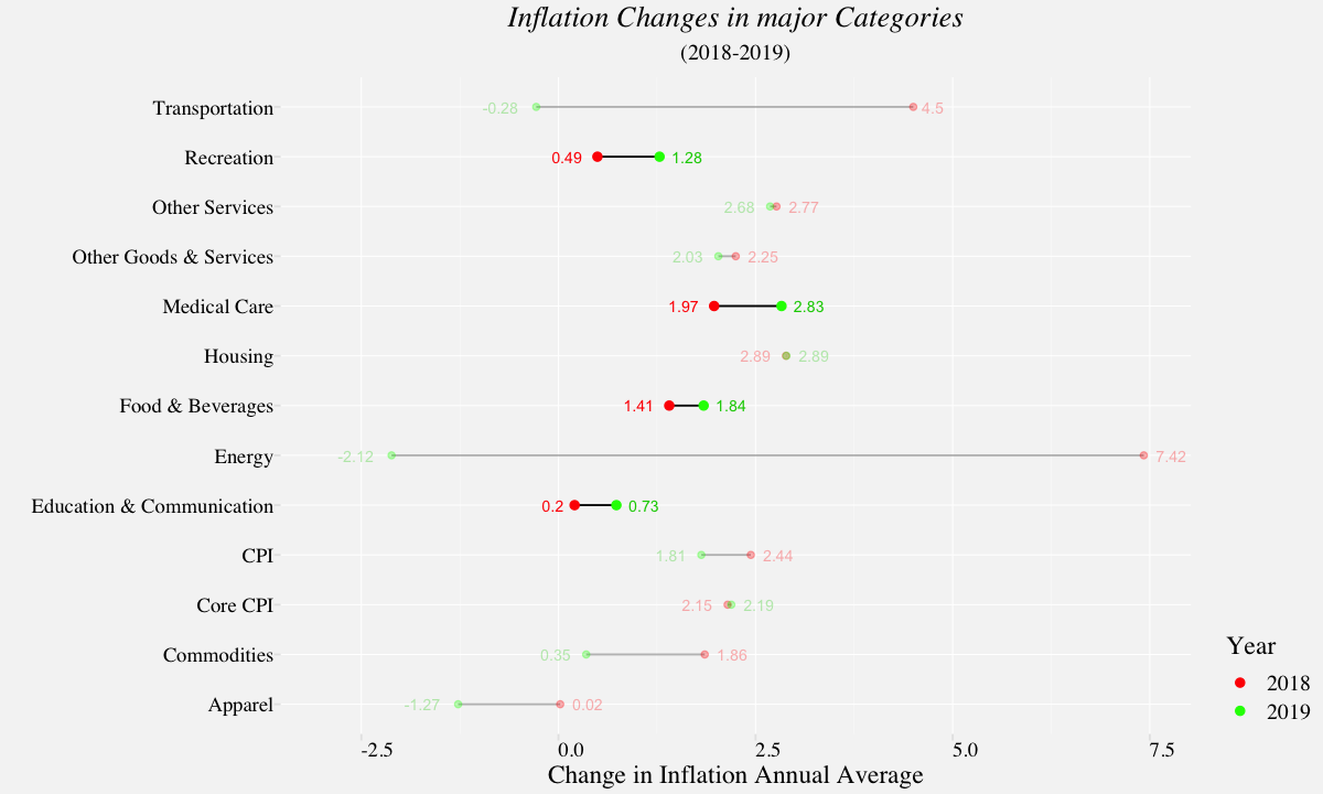
In the above example, we have considered depicting Gold fixing price. Although this is a simple and basic case of dot plot, they are capable of depicting lot more information. In the next example, we use dot plot to visualize the rate of inflation from 2018 to 2019 and highlight the categories which underwent more than 20% rise in inflation rate.
# Creating a data frame that identifies inflation changes over 20%
cpi_diff <- filter(cpi_annualavg,Year %in% c('2018','2019')) %>%
            select(Year,Category,AnnualAvgChange) %>%
            spread(Year,AnnualAvgChange) %>%
            rename(Year_2019=3,Year_2018=2) %>%
            group_by(Category) %>%
            mutate(Diff = Year_2019 / Year_2018 - 1) %>%
            arrange(desc(Diff)) %>%
            filter(Diff > .2)

# Creating a data frame for labels
labels_df <- filter(cpi_annualavg,Year %in% c('2018','2019')) %>%
             select(Year,Category,AnnualAvgChange) %>%
             spread(Year,AnnualAvgChange) %>%
             rename(Year_2019=3,Year_2018=2) %>%
             group_by(Category) %>%
             mutate(left_label = min(Year_2018,Year_2019),
                    right_label = max(Year_2018,Year_2019)) %>%
             mutate(left_Year=if_else(left_label==Year_2018,"2018","2019"),
                    right_Year=if_else(right_label==Year_2018,"2018","2019"))

left_labels <- select(labels_df,"Category","left_label","left_Year")
right_labels <- select(labels_df,"Category","right_label","right_Year")

# Creating the main data frame for dot plot
df_cpi <- select(labels_df,"Category","Year_2018","Year_2019") %>%
         gather(Year,AnnualAvgChange,-Category)

# Filtering main data frame to including Categories where the inflation changes exceeds 20%.
highlight <- filter(df_cpi,Category %in% cpi_diff$Category)

# Plots dot plot showing changes in CPI from 2018-2019 in all major categories
cpi_dualdotplot <-
ggplot(df_cpi,aes(x = df_cpi$AnnualAvgChange,y=df_cpi$Category)) +
        geom_line(aes(group = Category), alpha = .3) +
        geom_point(aes(color = Year), size = 1.5, alpha = .3) +
        geom_line(data = highlight,
                  aes(x = highlight$AnnualAvgChange,
                      y=highlight$Category,
                      group = Category)) +
        geom_point(data = highlight,
                   aes(x = highlight$AnnualAvgChange,
                       y=highlight$Category,
                       color = Year),
                   size = 2) +
        geom_text(data=left_labels,
                  aes(x= left_labels$left_label,
                      y= left_labels$Category,
                      label = round(left_labels$left_label, 2)),
                  color=left_labels$left_Year,
                  alpha= if_else(right_labels$Category %in% highlight$Category,1,0.3),
                  size = 3,
                  hjust = 1.5) +
        geom_text(data=right_labels,
                  aes(x= right_labels$right_label,
                      y= right_labels$Category,
                      label = round(right_labels$right_label, 2)),
                  color=right_labels$right_Year,
                  size = 3,
                  alpha = if_else(right_labels$Category %in% highlight$Category,1,0.3),
                  hjust = -.4) +
        theme_pprabhu_grid() +
        scale_colour_manual(
          values = c("red","green"),
          breaks = c("Year_2018", "Year_2019"),
          labels = c("2018", "2019")) +
        labs(title="Inflation Changes in major Categories",
             subtitle="(2018-2019)",
             x="Change in Inflation Annual Average",
             y="") +
        theme(legend.position="right",
              legend.justification = c("right", "bottom"),
              legend.margin = margin(5, 5, 5, 5),
              axis.text.x = element_text(angle=0),
              plot.title=element_text(hjust=0.5,face = "italic"),
              plot.subtitle=element_text(hjust=0.5)) +
        xlim(-3,7.5)

cpi_dualdotplot
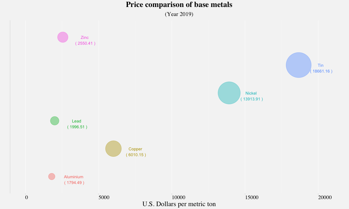
Bubble Chart
A bubble chart uses areas of circle to represent the quantity of a numeric variable. It is a preferred when we want to represent relationship between two or more numeric variables. In the following example, we represent the prices of base metals for the year 2019.
bubble_df <- base_metals %>%
             filter(base_metals$Year==2019) %>%
             group_by(Commodity) %>%
             summarise(AnnualPrice = round(mean(Value),2))

basemetals_bubbleplot <-
ggplot(bubble_df,aes(x=AnnualPrice,
                     y=Commodity,
                     color = Commodity,
                     size=AnnualPrice)) +
    geom_point(aes(size=AnnualPrice),alpha=0.4) +
    scale_size(range = c(6, 24),
               name="Annual Price") +
    geom_text(aes(x=AnnualPrice+1500,
                  y = Commodity,
                  label=paste("\n",Commodity,"\n","(",AnnualPrice,")")),
                  size=3) +
    labs(title="Price comparison of base metals",
             subtitle="(Year 2019)",
             x="U.S. Dollars per metric ton",
             y="") +
    xlim(0,21000)+
    theme_pprabhu_vgrid() +
    guides(color=FALSE,size=FALSE) +
    theme(axis.text.y = element_blank(),
          axis.ticks.y = element_blank(),
          axis.text.x = element_text(angle=0),
          plot.title = element_text(hjust=0.5),
          plot.subtitle = element_text(hjust=0.5))

basemetals_bubbleplot
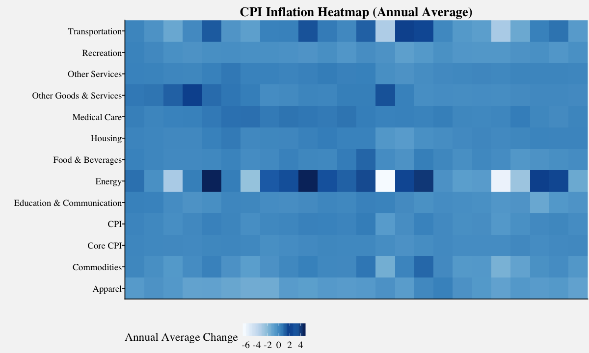
Heatmap
A heatmap depicts values for a main variable of interest across two axis variables as a grid and uses color coding to represent the quantity of values. In the below example, we generate a heatmap to depict historic monthly change in rate of inflation for major categories.
# Plots the heatmap on the CPI monthly Percent Change data
heatmap_plot <-
ggplot(data=filter(cpi_annualavg,Year>1995),
       aes(x=Year,
           y=Category,
           fill=scale(AnnualAvgChange))) +
       geom_tile(size=0.35,
                 aes(fill = scale(AnnualAvgChange))) +
       labs(x="",
            y="",
            fill = "Annual Average Change") +
       ggtitle("CPI Inflation Heatmap (Annual Average)") +
       scale_x_discrete(expand = c(0, 0)) +
       scale_y_discrete(expand = c(0, 0)) +
       theme_pprabhu() +
       scale_fill_pprabhu(palette = "sseq",
                          discrete=FALSE,
                          reverse = FALSE) +
       theme(plot.title = element_text(hjust = 0.5,vjust=-0.5),
             axis.text.x = element_text(angle=0),
             legend.position="bottom",
             legend.direction = "horizontal")


heatmap_plot
Thanks for reading! As I mentioned in the beginning, there are a lot of cool visualization techniques available for visualizing amounts. To modify the visualizations with your own data, Click Colab Notebook to edit and run the workbook using Google Colab. If you want to get in touch with me, feel free to reach me on my email. You can also view the code in my Github repository .