Financial Data Visualization - Distributions
This article is part of financial data visualization series where we cover most prominent plots used to quickly comprehend thousands or even millions of data points to support decision-making in finance. In this article, we examine ways of visualizing distributions in finance.
Analyzing and visualizing distributions is widely used in Data Science projects since we are interested in understanding the behaviour of a numeric variable. In other words, we would want to know the central tendency of a variable as well as the outliers. We would also be interested in knowing if the variable is symmetrically distributed or skewed, if the distribution is unimodal/bimodal/multimodal, if it contains suspicious/impossible values and so on.
Here’s a list of visualizations that we included in this article for visualizing distributions. You can click on any specific visualization below to navigate directly to the visualization.
1. Histogram
2. Density Plot
3. Empirical cumulative distribution function
4. Boxplot
5. Violin Plot
6. Strip Chart
7. Jitter plot
8. Sina Plot
9. Ridgeline Plot
10. Quantile–quantile plot
We will be using quandl api and quantmod api to import financial data. Using an API for importing data is beneficial, especially in finance, because the dataset is updated extremely frequently, and they offer a lot of benefits in terms of ease and flexibility.
We can install quandl & quantmod packages and register an account on quandl.com
Create a free Quandl account and set your API key here
For more information, refer to the link below :
https://www.quandl.com/tools/r
# Run the script below with your secret key obtained after registering on quandl
# quandl_sk = "<quandl secret key>"

# Alternative way to Load Data Tokens by declaring them in a file
source("../R/Setup/apitokens.r")

# Data manipulation libraries used in this notebook
library(tibble) # includes rownames_to_column function
library(dplyr) # includes filter function
library(tidyr) # includes spread function

# Visualization libraries used in this notebook
library(ggplot2) # Includes ggplot function
library(ggforce) # Includes geom_sina & geom_parallel_sets
library(ggridges) # Includes geom_
library(cowplot) # Includes axis_canvas for generating A Canvas Onto Which One Can Draw Axis-Like Objects

# Data API libraries
library(Quandl) # To import data from Quandl API
library(quantmod) # To import data using yahoo,google api

# Animation Packages
library(gganimate) # to add animation to static plot
library(gifski) # Converts images to GIF animations
library(png) # Provides an easy and simple way to read, write and display bitmap images stored in the PNG format.

# Datetime Parsing functions
library(lubridate) # includes datetime parsing functions

# Data visualization addon library for Themes and colors available in my github repository
# https://github.com/prabhupavitra/dviz.addon
library(dviz.addon)

# Resizing plot width and height from default 7
# https://www.rdocumentation.org/packages/repr/versions/0.7/topics/repr-options
options(repr.plot.width=10, repr.plot.height=4)
Importing Data (Using Quandl and quantmod API)
This notebook uses Quandl and quantmod API to import Financial Data directly to R.
Datasets used in this notebook include:
1. Historical Prices of Precious Metals (Gold, Silver, Platinum and Palladium)
2. Historical Prices of Non-Ferrous Base Metals (Aluminum; Copper; Lead; Nickel; Tin and Zinc)
3. Consumer Price Index for All Urban Consumers (CPI-U)
Precious Metals Prices : London Fixing (U.S. Dollars per Troy Ounce)
# Using Quandl API : Import prices of Precious Metals ( Gold, Silver, Platinum, Palladium )

# Gold Price: London Fixing
gold <- Quandl("LBMA/GOLD", api_key=quandl_sk)

# Silver Price: London Fixing
silver <- Quandl("LBMA/SILVER", api_key=quandl_sk)

# Platinum Fixing
platinum <- Quandl("LPPM/PLAT", api_key=quandl_sk)

# Palladium
palladium <- Quandl("LPPM/PALL", api_key=quandl_sk)
Base Metals Prices : Spot Prices (U.S. Dollars per metric ton)
# Other Base Metals (Aluminum; Cobalt; Copper; Iron Ore; Lead; Molybdenum; Nickel; Tin; Uranium and Zinc)

# Aluminum; 99.5% minimum purity; LME spot price; CIF UK ports; US$ per metric ton
aluminium <- Quandl("ODA/PALUM_USD", api_key=quandl_sk)

# Copper; grade A cathode; LME spot price; CIF European ports; US$ per metric ton
copper <- Quandl("ODA/PCOPP_USD", api_key=quandl_sk)

# Lead; 99.97% pure; LME spot price; CIF European Ports; US$ per metric ton
lead <- Quandl("ODA/PLEAD_USD", api_key=quandl_sk)

# Nickel; melting grade; LME spot price; CIF European ports; US$ per metric ton
nickel <- Quandl("ODA/PNICK_USD", api_key=quandl_sk)

# Tin; standard grade; LME spot price; US$ per metric ton
tin <- Quandl("ODA/PTIN_USD", api_key=quandl_sk)

# Zinc; high grade 98% pure; US$ per metric ton
zinc <- Quandl("ODA/PZINC_USD", api_key=quandl_sk)
CPI Data : CPI for U.S. City Average (Units: Index 1982-1984=100, Seasonally Adjusted ; Frequency: Monthly)
# Consumer Price Index for All Urban Consumers: All Items in U.S. City Average
monthly_allitems <- Quandl("FRED/CPIAUCSL", api_key=quandl_sk)

# Consumer Price Index for All Urban Consumers: Food and Beverages in U.S. City Average
monthly_foodbev <- Quandl("FRED/CPIFABSL", api_key=quandl_sk)

# Consumer Price Index for All Urban Consumers: All Items Less Food and Energy in U.S. City Average
monthly_excfoodnbev <- Quandl("FRED/CPILFESL", api_key=quandl_sk)

# Consumer Price Index for All Urban Consumers: Recreation in U.S. City Average
monthly_recreation <- Quandl("FRED/CPIRECSL", api_key=quandl_sk)

# Consumer Price Index for All Urban Consumers: Housing in U.S. City Average
monthly_housing <- Quandl("FRED/CPIHOSNS", api_key=quandl_sk)

# Consumer Price Index for All Urban Consumers: Education and Communication in U.S. City Average
monthly_eduncomm <- Quandl("FRED/CPIEDUSL", api_key=quandl_sk)

# Consumer Price Index for All Urban Consumers: Apparel in U.S. City Average
monthly_apparel <- Quandl("FRED/CPIAPPSL", api_key=quandl_sk)

# Consumer Price Index for All Urban Consumers: Energy in U.S. City Average
monthly_energy <- Quandl("FRED/CPIENGSL", api_key=quandl_sk)

# Consumer Price Index for All Urban Consumers: Other Goods and Services in U.S. City Average
monthly_othergns <- Quandl("FRED/CPIOGSSL", api_key=quandl_sk)

# Consumer Price Index for All Urban Consumers: Transportation in U.S. City Average
monthly_trnsprt <- Quandl("FRED/CPITRNSL", api_key=quandl_sk)

# Consumer Price Index for All Urban Consumers: Services in U.S. City Average
monthly_otherserv <- Quandl("FRED/CUSR0000SAS", api_key=quandl_sk)

# Consumer Price Index for All Urban Consumers: Commodities in U.S. City Average
monthly_commod <- Quandl("FRED/CUSR0000SAC", api_key=quandl_sk)

# Consumer Price Index for All Urban Consumers: Medical Care in U.S. City Average
monthly_medcare <- Quandl("FRED/CPIMEDSL", api_key=quandl_sk)
Bitcoin and IBM Stock Data from Yahoo : Using Quantmod Package
cryptodata <- new.env() #Make a new environment for quantmod to store data in

beginDate = as.Date("2014-04-01") #Specify period of time we are interested in
endDate = as.Date("2019-12-01")

ticker <- c("BTC-USD","IBM") #Define the tickers we are interested in

#Download the stock historical data (for all tickers mentioned previously)
getSymbols(ticker, env = cryptodata, src = "yahoo", from = beginDate, to = endDate,auto.assign=TRUE)

btcusd <- data.frame(get("BTC-USD", envir = cryptodata))
ibmstock <- data.frame(get("IBM", envir = cryptodata))
Data Preparation
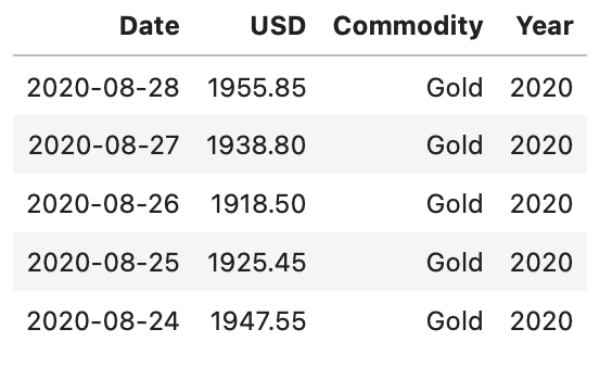
Precious Metals Prices : London Fixing (U.S. Dollars per Troy Ounce)
# Merging the datasets of all 4 precious metals (Measured per Troy Ounce)
precious_metals <-
rbind(gold %>% select("Date","USD (AM)") %>% rename(USD="USD (AM)") %>% mutate(Commodity="Gold"),
silver %>% select("Date","USD") %>% mutate(Commodity="Silver"),
platinum %>% select("Date","USD AM") %>% rename(USD="USD AM") %>% mutate(Commodity="Platinum"),
palladium %>% select("Date","USD AM") %>% rename(USD="USD AM") %>% mutate(Commodity="Palladium")) %>%
mutate(Year = year(Date)) %>% filter(USD!="NA")

head(precious_metals,5)
Base Metals Prices : Spot Prices (U.S. Dollars per metric ton)
base_metals <-
rbind(aluminium %>% mutate(Commodity="Aluminium"),
      copper %>% mutate(Commodity="Copper"),
      lead %>% mutate(Commodity="Lead"),
      nickel %>% mutate(Commodity="Nickel"),
      tin %>% mutate(Commodity="Tin"),
      zinc %>% mutate(Commodity="Zinc")) %>%
mutate(Year = year(Date))

head(base_metals,1)

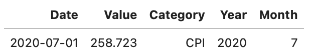
CPI Data : CPI for U.S. City Average
cpi_monthly_sa <-
rbind(monthly_allitems %>% mutate(Category="CPI"),
      monthly_excfoodnbev %>% mutate(Category="Core CPI"),
      monthly_apparel %>% mutate(Category="Apparel"),
      monthly_commod %>% mutate(Category="Commodities"),
      monthly_eduncomm %>% mutate(Category="Education & Communication"),
      monthly_energy %>% mutate(Category="Energy"),
      monthly_foodbev %>% mutate(Category="Food & Beverages"),
      monthly_housing %>% mutate(Category="Housing"),
      monthly_medcare %>% mutate(Category="Medical Care"),
      monthly_othergns %>% mutate(Category="Other Goods & Services"),
      monthly_otherserv %>% mutate(Category="Other Services"),
      monthly_recreation %>% mutate(Category="Recreation"),
      monthly_trnsprt %>% mutate(Category="Transportation")) %>%
mutate (Year =year(Date),Month=month(Date))

head(cpi_monthly_sa,1)
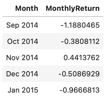
Calculating Return on Bitcoin Data from Yahoo
btcusd_return <-
btcusd %>% rename("Adjusted_Close" = "BTC.USD.Adjusted",
                  "Trading_Volume" = "BTC.USD.Volume",
                  "High" = "BTC.USD.High",
                  "Open" = "BTC.USD.Open",
                  "Low" = "BTC.USD.Low",
                  "Close" = "BTC.USD.Close") %>%
rownames_to_column("Date") %>%
mutate(Return = (Adjusted_Close/lag(Adjusted_Close)-1)*100,
       Trading_Volume_millions = Trading_Volume/(10^6)) %>% filter(Return!="NA")

head(btcusd_return,1)

We will also calculate monthly return for the bitcoin and IBM stock data.
btcusd_monthlyret <- btcusd_return %>%
                     mutate(Month = as.yearmon(Date)) %>%
                     arrange(Month) %>%
                     group_by(Month) %>%
                     summarise(MonthlyReturn = mean(Return))

head(btcusd_monthlyret,5)
ibmstock_return <- ibmstock %>%
rename("Adjusted_Close"="IBM.Adjusted") %>%
mutate(Return=(Adjusted_Close/lag(Adjusted_Close)-1)*100) %>%
filter(Return!="NA")
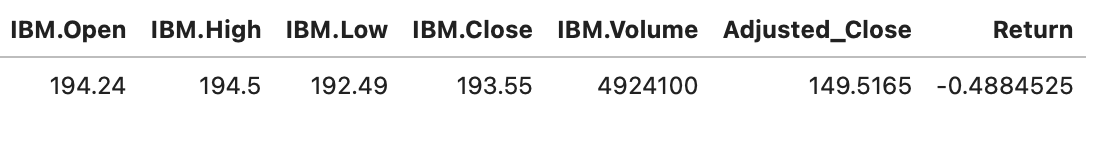
head(ibmstock_return,1)
Before we proceed with visualizations, we will calculate some commonly used CPI metrics
# Percent Change (1982-Present)
cpi_pctchng <- filter(cpi_monthly_sa,#Month==1,
                                     Year>1982,
                                     !(Category %in% c('Energy','Transport'))) %>%
               group_by(Category) %>%
               arrange(Date) %>%
               mutate(PercentChange = (Value/lag(Value)-1)*100) %>%
               filter(PercentChange!="NA")

# Over-the-year percent change
cpi_otypct <-
cpi_monthly_sa %>%
filter(Year>1982,Month==12) %>%
arrange(Date) %>%
group_by(Category) %>%
mutate(OverYrPercentChange = (Value/lag(Value)-1)*100) %>%
filter(OverYrPercentChange!="NA")


# Annual Average, Annual Average CHange and Purchasing Power
cpi_annualavg <-
cpi_monthly_sa %>% filter(Year>1982,Year<2020) %>%
arrange(Date) %>%
group_by(Year,Category) %>%
summarise(AnnualAvg = mean(Value)) %>%
group_by(Category) %>%
mutate(AnnualAvgChange = (AnnualAvg/lag(AnnualAvg)-1)*100,
       PurchasingPower = (AnnualAvg/lag(AnnualAvg)*100)) %>%
filter(AnnualAvgChange!="NA")
Univariate Distributions
A univariate distribution refers to the distribution of just one random variable and understanding their form and function is extremely useful in data science. When visualizing a univariate distribution our purpose is to see how a single variable is spread. One can use this plot when visualizing a single variable. Histograms and density plots are a popular choice for visualizing single distribution.
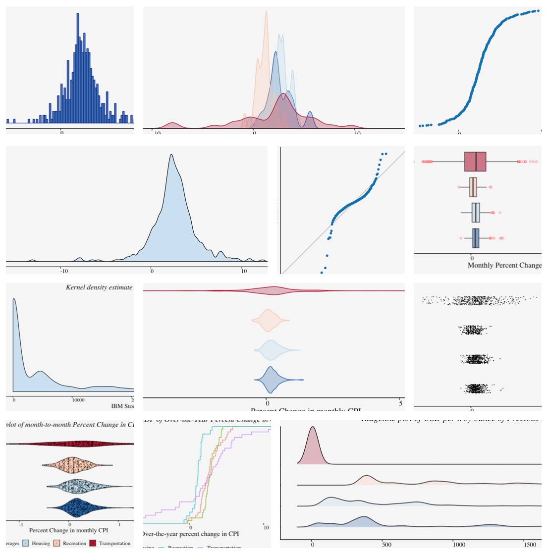
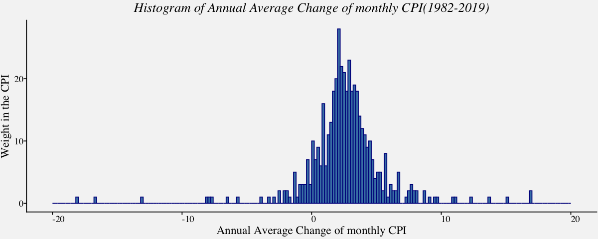
Histogram
One of the simplest ways to show data spread is Histogram. To construct a histogram from a continuous variable you first need to split the data into intervals, called bins. Depending on the data distribution and the purpose of visualization, an appropriate bin width is chosen. Although software chooses a default bin width, it is vital to understand data-based binning techniques used in estimating bin width.
# Histogram using geom_histogram() of Annual average change of monthly CPI
cpi_histplot <-
ggplot(cpi_annualavg, aes(x = cpi_annualavg$AnnualAvgChange)) +
  geom_histogram(breaks=seq(-20,20,by=0.2),
                 col="darkblue",
                 fill="steelblue")  +
  labs(x="Annual Average Change of monthly CPI",y="Weight in the CPI") +
  ggtitle("Histogram of Annual Average Change of monthly CPI(1982-2019)") +
  theme_pprabhu() +
  theme(plot.title = element_text(hjust = 0.5,face="italic"),
        axis.text.x = element_text(angle=0))

cpi_histplot
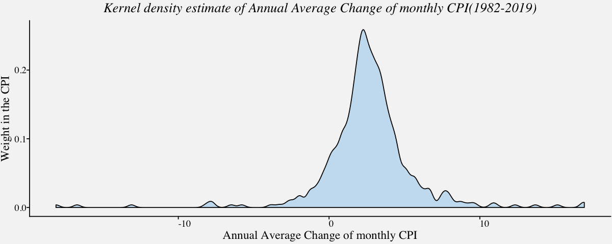
Density Plot
Kernel Density plots are a popular choice for visualizing single as well as multiple distributions because it creates a smooth curve on a given set of data. The smoothness of the curve is controlled by a bandwidth parameter that is analogous to the histogram bin width.
# Kernel density estimaction using geom_density()
cpi_kerneldensity <-
  ggplot(cpi_annualavg, aes(x = cpi_annualavg$AnnualAvgChange)) +
  geom_density(fill="#56B4E950",alpha=0.3,adjust=1/2) +
  labs(x="Annual Average Change of monthly CPI",y="Weight in the CPI") +
  ggtitle("Kernel density estimate of Annual Average Change of monthly CPI(1982-2019)") +
  theme_pprabhu() +
  theme(plot.title = element_text(hjust = 0.5,face="italic"),
        axis.text.x = element_text(angle=0))

cpi_kerneldensity
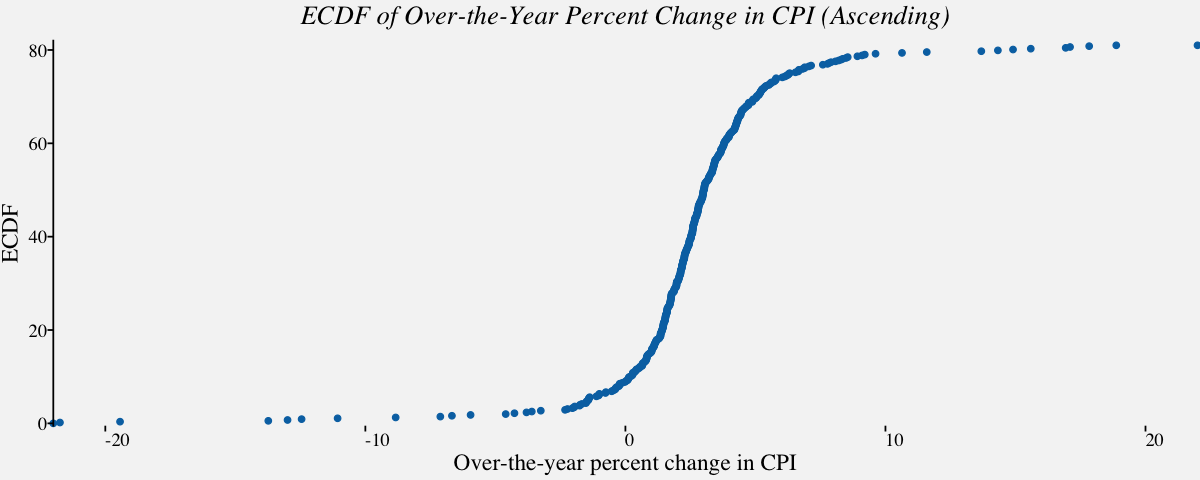
Empirical cumulative distribution function
An Empirical cumulative distribution function(ECDF) is an estimator of the Cumulative Distribution Function. The ECDF allows you to plot a feature of your data in order from least to greatest and see the whole feature as if is distributed across the data set. It has some useful properties such as being consistent and having a known confidence band. Best of all, it’s non-parametric so it will work with pretty much any distribution.
# Empirical cumulative distribution function in ascending order for December Over-the-year percent change in CPI
# ecdf using stat_ecdf() ; geom = "step" can be used for a step ecdf
cpi_ecdf_plot <-
ggplot(cpi_otypct, aes(x = cpi_otypct$OverYrPercentChange,
                     y =81*..y..)) +
  stat_ecdf(geom = "point", color = "#0072B2") +
  scale_x_continuous(limits = c(-22, 22),
                     expand = c(0, 0),
                     name="Over-the-year percent change in CPI") +
  scale_y_continuous(limits = c(-.5, 82),
                     expand = c(0, 0),
                     name = "ECDF") +
  coord_cartesian(clip = "off") +
  theme_pprabhu() +
  ggtitle("ECDF of Over-the-Year Percent Change in CPI (Ascending)") +
  theme(axis.line.x = element_blank(),
        plot.title=element_text(hjust = 0.5,face="italic"),
        axis.text.x = element_text(angle=0))

cpi_ecdf_plot
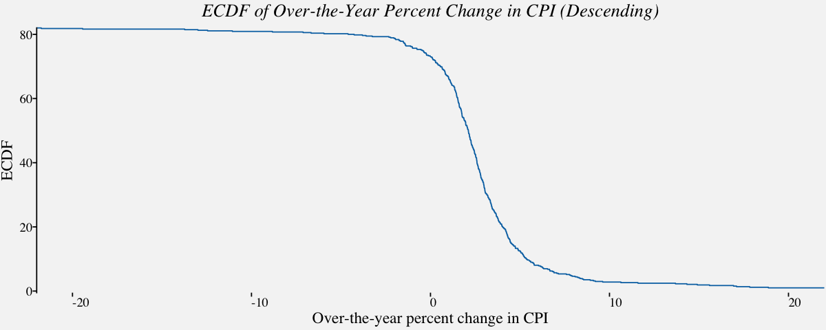
# Empirical cumulative distribution function in descending order
ggplot(cpi_otypct, aes(x = cpi_otypct$OverYrPercentChange,
                         y = 82-81*..y..)) +
  stat_ecdf(geom = "step", color = "#0072B2") +
  scale_x_continuous(limits = c(-22, 22),
                     expand = c(0, 0),
                     name="Over-the-year percent change in CPI") +
  scale_y_continuous(limits = c(-.5, 82),
                     expand = c(0, 0),
                     name = "ECDF") +
  coord_cartesian(clip = "off") +
  theme_pprabhu() +
  ggtitle("ECDF of Over-the-Year Percent Change in CPI (Descending)") +
  theme(axis.line.x = element_blank(),
        plot.title=element_text(hjust = 0.5,face="italic"),
        axis.text.x = element_text(angle=0))
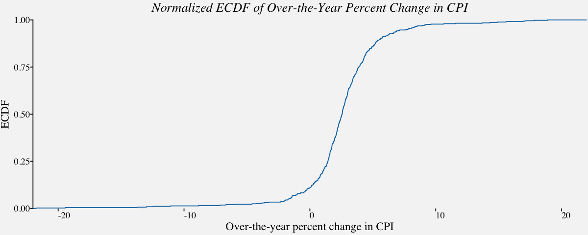
# Normalized ecdf
ggplot(cpi_otypct, aes(x = cpi_otypct$OverYrPercentChange,
                         y =..y..)) +
  stat_ecdf(geom = "step", color = "#0072B2") +
  scale_x_continuous(limits = c(-22, 22),
                     expand = c(0, 0),
                     name="Over-the-year percent change in CPI") +
  scale_y_continuous(limits = c(0, 1),
                     expand = c(0, 0),
                     name = "ECDF") +
  coord_cartesian(clip = "off") +
  theme_pprabhu() +
  ggtitle("Normalized ECDF of Over-the-Year Percent Change in CPI") +
  theme(axis.line.x = element_blank(),
        plot.title=element_text(hjust = 0.5,face="italic"),
        axis.text.x = element_text(angle=0))
Multivariate Distributions
Visualizing multivariate distributions in a single plot arises in various situations as discussed in the following examples. For example, one might just be interested in comparing data spread of a single variable at various times for comparable data (Example: Price of precious metals); One may be curious about outliers or the density of the data points around a specified value; one might also want to compare multiple variables in a single dataset(Example: Salary distribution of male/female employees); One might be interested to know which data distribution is more volatile than the other; and so on.. The plots used in these scenarios depends on the number of distributions involved. The intention of the plot is to provide clarity on the purpose of the plot. Histograms and density plots are used when the number of distributions are less. This section is dedicated to multivariate data visualization in finance.
Density plot for Multivariate Distributions
Density plots are quite useful when visualizing multivariate continous variables. Here, we can estimate the underlying data-generating density by smoothing out the data points. Density plots work well for multiple distributions as they are somewhat distinct and contiguous.
# Plots the Kernel density estimation for multiple distributions distinct and contiguous
cpi_annualavg_kde <- filter(cpi_annualavg,Category %in% c('Housing',
                                                          'Transportation',
                                                          'Recreation',
                                                          'Food & Beverages'))

cpi_annualavg_kdeplot <-
ggplot(cpi_annualavg_kde,
       aes(x = cpi_annualavg_kde$AnnualAvgChange,
           color=cpi_annualavg_kde$Category,
           fill=cpi_annualavg_kde$Category)) +
  geom_density(alpha=0.3,adjust=1/2) +
  labs(fill="CPI Category",color="CPI Category") +
  scale_x_continuous(limits = c(-20, 20), name = "Annual Average Change of monthly Consumer Price Index", expand = c(0, 0)) +
  scale_y_continuous(limits = c(0,0.75), name = "Weight in the CPI", expand = c(0, 0)) +
  coord_cartesian(clip = "off") +
  ggtitle("Kernel density estimate of CPI Components") +
  theme_pprabhu() +
  scale_fill_manual(values=pprabhu_pal("div",reverse=TRUE)(4)) +
  scale_color_manual(values=pprabhu_pal("div",reverse=TRUE)(4)) +
  theme(plot.title = element_text(hjust = 0.5,face="italic"),
        legend.position = "bottom",
        axis.text.x = element_text(angle=0))

cpi_annualavg_kdeplot
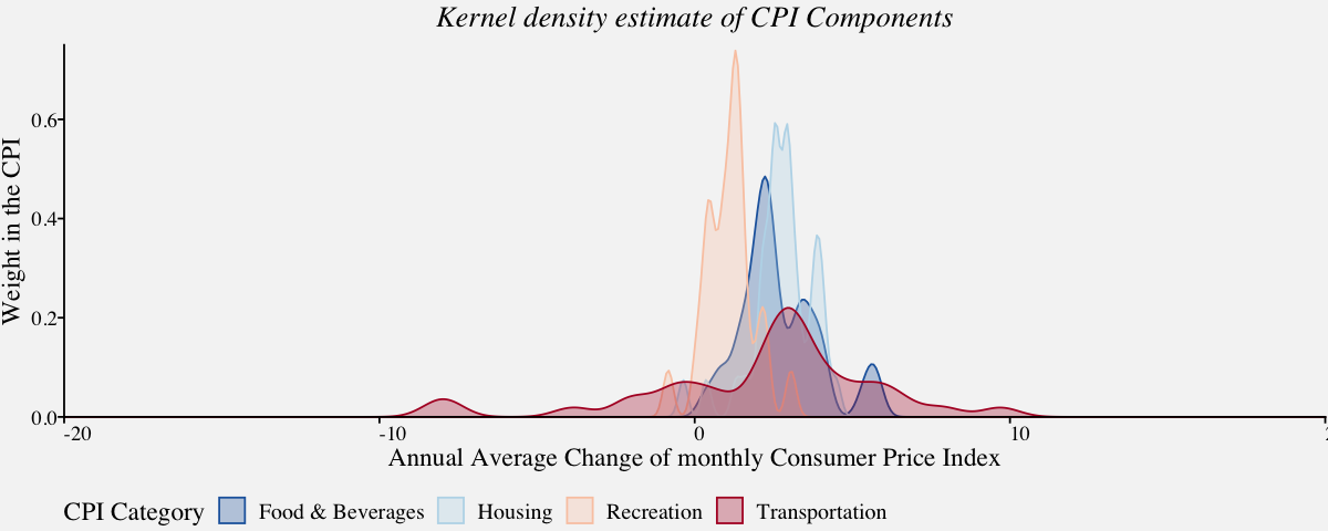
Although density plots are one of the versatile visualizations in finance, they have a number of complications. Firstly, there is a need for choosing a smoothing window. While a window size that is small enough to capture peaks in the dense regions of the data may lead to instable estimates else, a bigger window might smooth out pronounced features of the density, such as sharp peaks. Moreover, the density lines do not convey the information on how much data was used to estimate them, and plots can be especially problematic if the sample sizes for the curves differ.
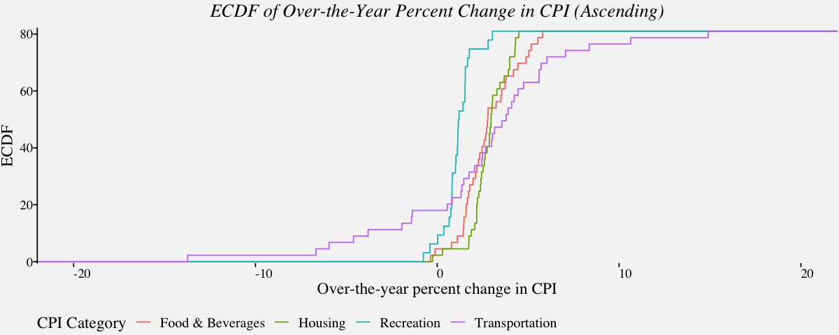
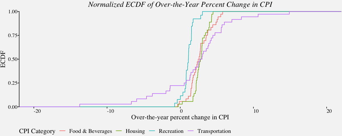
Empirical cumulative distribution plots for multiple distributions
Since density plots have a lot of drawbacks, a better alternative used for multivariate distributions is the ECDF plot. In the following example, we use ECDF plot to visualize the data previously visualized using density plots.
# Empirical cumulative distribution function in ascending order
# For December Over-the-year percent change in CPI (Categories : Housing, Food, Recreation and Transportation)
cpi_fstc <- filter(cpi_otypct,Category %in% c('Housing',
                                              'Transportation',
                                              'Recreation',
                                              'Food & Beverages'))

cpi_multecdf_plot <-
ggplot(cpi_fstc, aes(x = cpi_fstc$OverYrPercentChange,
                     y =81*..y..,
                     color =cpi_fstc$Category)) +
  stat_ecdf(geom = "step") +
  labs(color="CPI Category") +
  scale_x_continuous(limits = c(-22, 22),
                     expand = c(0, 0),
                     name="Over-the-year percent change in CPI") +
  scale_y_continuous(limits = c(-.5, 82),
                     expand = c(0, 0),
                     name = "ECDF") +
  coord_cartesian(clip = "off") +
  theme_pprabhu() +
  ggtitle("ECDF of Over-the-Year Percent Change in CPI (Ascending)") +
  theme(axis.line.x = element_blank(),
        plot.title=element_text(hjust = 0.5,face="italic"),
        axis.text.x = element_text(angle=0))

cpi_multecdf_plot
# Normalized ecdf for Multiple distributions
ggplot(cpi_fstc, aes(x = cpi_fstc$OverYrPercentChange,
                       y =..y..,
                       color=cpi_fstc$Category)) +
  stat_ecdf(geom = "step") +
  labs(color="CPI Category") +
  scale_x_continuous(limits = c(-22, 22),
                     expand = c(0, 0),
                     name="Over-the-year percent change in CPI") +
  scale_y_continuous(limits = c(0, 1),
                     expand = c(0, 0),
                     name = "ECDF") +
  coord_cartesian(clip = "off") +
  theme_pprabhu() +
  ggtitle("Normalized ECDF of Over-the-Year Percent Change in CPI") +
  theme(axis.line.x = element_blank(),
        plot.title=element_text(hjust = 0.5,face="italic"),
        axis.text.x = element_text(angle=0))
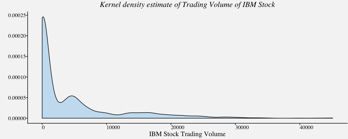
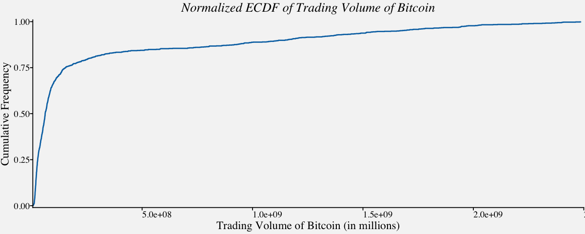
Highly Skewed Distributions
So far, we analyzed univariate and multivariate distributions easily using density and ECDF plots since the distribution was normal or near normal. Visualizing highly skewed distributions are quite tricky. Using density plots or ECDF plots render little to no information about the underlying data. For instance, lets visualize trading volume of IBM stock to understand the same.
# Density plot of a Highly skewed distribution : Trading Volume of IBM Stock
ggplot(btcusd_return, aes(x = btcusd_return$Trading_Volume_millions)) +
  geom_density(fill="#56B4E950",alpha=0.3,adjust=1) +
  labs(x="IBM Stock Trading Volume",y="") +
  theme_pprabhu() +
  ggtitle("Kernel density estimate of Trading Volume of IBM Stock") +
  theme(plot.title = element_text(hjust = 0.5,face="italic"),
        axis.text.x = element_text(angle=0))
# Normalized ECDF of a Highly skewed distribution : Trading Volume of Bitcoin
ggplot(btcusd_return, aes(x = btcusd_return$Trading_Volume, y =..y..)) +
  stat_ecdf(geom = "step",
            color = "#0072B2",
            size = 0.75,
            pad = FALSE) +
  theme_minimal() +
  scale_x_continuous(limits = c(0.5e+07, 2.5e+09),
                     expand = c(0, 0),
                     name="Trading Volume of Bitcoin (in millions)") +
  scale_y_continuous(limits = c(-.01, 1.01),
                     expand = c(0, 0),
                     name = "Cumulative Frequency") +
  coord_cartesian(clip = "off") +
  theme_pprabhu() +
  ggtitle("Normalized ECDF of Trading Volume of Bitcoin") +
  theme(plot.title=element_text(hjust = 0.5,face="italic"),
        axis.text.x = element_text(angle=0))
Log transformation, is a widely used method to address skewed data, is one of the most popular transformations used to reduce right skewness.
# Density plot of logarithm of a Highly skewed distribution : Trading Volume of Bitcoin
ggplot(btcusd_return, aes(x = log10(btcusd_return$Trading_Volume))) +
  geom_density(fill="#56B4E950",alpha=0.3) +
  scale_x_continuous(
    expand = c(0, 0),
    name = expression(paste("log"["10"], "(Trading Volume)"))) +
  scale_y_continuous(expand = c(0, 0), name = "density") +
  theme_pprabhu() +
  ggtitle("Kernel density estimate of Logarithm of Trading Volume of Bitcoin") +
  theme(plot.title = element_text(hjust = 0.5,face="italic"),
        axis.text.x = element_text(angle=0))
# ECDF of logarithm of a right skewed distribution : Trading Volume of IBM Stock
ggplot(btcusd_return, aes(x = log10(btcusd_return$Trading_Volume))) +
  stat_ecdf(geom = "step",
            color = "#0072B2",
            pad = FALSE) +
  scale_x_continuous(
    expand = c(0.01, 0),
    name = expression(paste("log"["10"], "(Trading Volume)"))) +
  scale_y_continuous(expand = c(0.01, 0), name = "cumulative frequency") +
  coord_cartesian(clip = "off") +
  theme_pprabhu() +
  ggtitle("Normalized ECDF of logarithm of Trading Volume of IBM Stock") +
  theme(plot.title=element_text(hjust = 0.5,face="italic"),
        axis.text.x = element_text(angle=0))
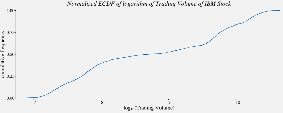
One of the notable applications of ECDF plot is in identifying whether the data follows Power law. The next section is a brief overview of Power Law Distributions.
Power Law Distributions
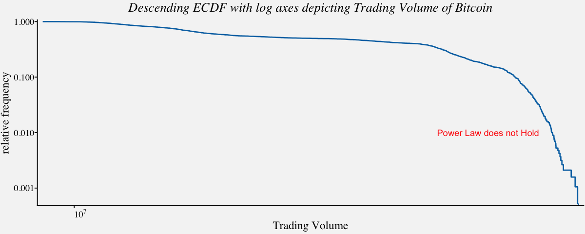
A power law is a statistical distribution over a quantity x following the form $x^{−α}$, with α constant. Among other things, this means that when plotted on doubly logarithmic scales, the cumulative distribution function for a power law follows a straight line with slope 1 – α. Measurement of the slope can give a rough estimate of α. The log‐log plots that we discussed in the previous section are widely used as a simple visual diagnostic for power‐law behaviour. In other words, to see that this distribution is not a power law, we plot two quantities against each other with logarithmic axes and they show do not show a linear relationship. This indicates that the two quantities do not have a power law distribution. On the contrary, if the descending ecdf with logarithmic axes shows perfect linerarity, we would conclude that the variables follow power law distribution. In the following example, we shall check if the trading volume of bitcoin follows power law or not.
# Descending ecdf with logarithmic x and y axes ;
ggplot(btcusd_return, aes(x=btcusd_return$Trading_Volume, y = 1-..y..)) +
stat_ecdf(geom = "step",
color = "#0072B2",
size = 0.75,
pad = FALSE) +
scale_x_log10(expand = c(0.01, 0),
breaks = c(1e2, 1e3, 1e4, 1e5, 1e6, 1e7),
labels = c(expression(10^2), expression(10^3), expression(10^4),
expression(10^5), expression(10^6), expression(10^7)),
name = "Trading Volume") +
scale_y_log10(expand = c(0.01, 0), breaks = c(1e-3, 1e-2, 1e-1, 1), name = "relative frequency") +
theme_pprabhu() +
annotate("text", x = 10^10, y = 0.01, label = "Power Law does not Hold",color="red") +
ggtitle("Descending ECDF with log axes depicting Trading Volume of Bitcoin") +
theme(plot.title=element_text(hjust = 0.5,face="italic"),
axis.text.x = element_text(angle=0))
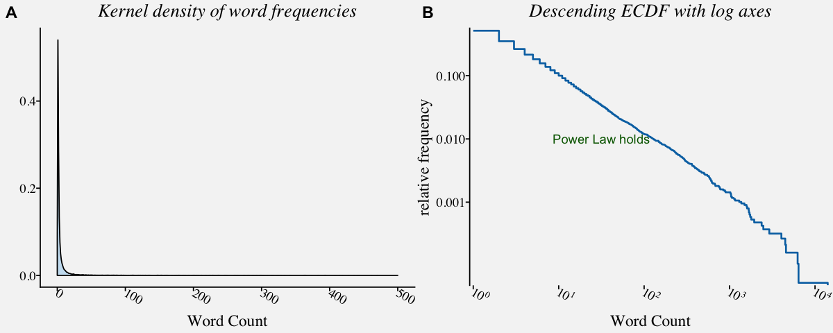
# When Power law holds, the plot will look like like a straight line
library("poweRlaw")

# The Moby Dick data set contains the frequency of unique words in the novel Moby Dick by Herman Melville.
data("moby", package="poweRlaw")
moby_df <- data.frame(moby)

# Density plot of a Highly skewed distribution : Trading Volume of IBM Stock
moby_kde <-
ggplot(moby_df, aes(x = moby)) +
  geom_density(fill="#56B4E950",alpha=0.3,adjust=1) +
  theme_minimal() +
  xlim(0,500) +
  theme_pprabhu() +
  labs(x="Word Count",y="") +
  ggtitle("Kernel density of word frequencies") +
  theme(plot.title = element_text(hjust = 0.5,face="italic"))

# Descending ecdf with logarithmic x and y axes ; When Power law holds, the plot will look like like a straight line
moby_powerlaw <-
ggplot(moby_df, aes(x=moby, y = 1-..y..)) +
  stat_ecdf(geom = "step",
            color = "#0072B2",
            size = 0.75,
            pad = FALSE) +
  scale_x_log10(expand = c(0.01, 0),
                breaks = c(1e0, 1e1, 1e2, 1e3, 1e4),
                labels = c(expression(10^0), expression(10^1), expression(10^2),
                           expression(10^3), expression(10^4)),
                name = "Word Count") +
  scale_y_log10(expand = c(0.01, 0), breaks = c(1e-3, 1e-2, 1e-1, 1), name = "relative frequency") +
  annotate("text", x = 10^1.5, y = 0.01, label = "Power Law holds",color="darkgreen") +
  ggtitle("Descending ECDF with log axes") +
  theme_pprabhu() +
  theme(axis.line.x = element_blank(),plot.title=element_text(hjust = 0.5,face="italic"))

plot_grid(moby_kde, moby_powerlaw, labels = "AUTO")
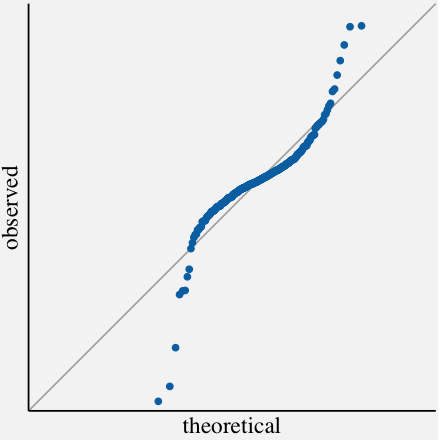
Quantile-Quantile plots
Q-Q plots are yet another way to visualize univariate distributions. The quantile-quantile (q-q) plot is a graphical technique for determining if two data sets come from populations with a common distribution. In general, the basic idea is to compute the theoretically expected value for each data point based on the distribution in question. If the data indeed follow the assumed distribution, then the points on the q-q plot will fall approximately on a straight line. In the following code, we visualize the annual average change in monthly CPI using Q-Q plot.
params <- as.list(MASS::fitdistr(cpi_annualavg$AnnualAvgChange,"normal")$estimate)

# Coordinates for the axis line segments
df_segment <- data.frame(x = c(-19,-19), xend = c(19,-19),y = c(-19, -19),yend = c(-19,19))

# Q-Q plot using stat_qq() and geom_abline()
ggplot(cpi_annualavg, aes(sample = cpi_annualavg$AnnualAvgChange)) +
  geom_abline(slope = 1, intercept = 0, color = "grey70") +
  stat_qq(dparams = params, color = "#0072B2") +
  geom_segment(
    data = df_segment,
    aes(x = x, xend = xend, y = y, yend = yend),
    size = 0.5, inherit.aes = FALSE) +
  scale_x_continuous(limits = c(-19, 19),
                     expand = c(0, 0),
                     breaks = 15*(5:10)) +
  scale_y_continuous(limits = c(-19,19),
                     expand = c(0, 0),
                     breaks = 10*(5:10),
                     name = "observed") +
  coord_fixed(clip = "off") +
  theme_pprabhu() +
  ggtitle("Q-Q plot of Annual Average Change in monthly CPI ") +
  theme(axis.line = element_blank(),plot.title=element_text(hjust = 0.5,face="italic"))
Multiple Univariate Distributions
Visualizing multiple univariate distributions in a single plot arises when we are interested in comparing attributes of the underlying data distributions. To be specific, we can use these following visualizations if we are interested in comparing attributes like density, skewness, median, minimum data value, maximum point density among many others. The most popular one among these visualizations is the box plot. Others include boxen plots, violin plots, strip chart, jitter plot, swarm plot, sina plot, ridgeline plots etc. Each has its own advantages and caveats. Additionally, we can compare the distributions vertically or horizontally depending on the attributes we are interested in. We shall discuss these above mentioned visualizations in detail in the following section.
Box plot
Box plots, also called as box and whisker plot, displays the five-number summary of the underlying distribution. They are very popular since they are simple yet so informative when visualizing multiple distributions at once. They are very useful in comparing median, range and outliers. In the following example, we will use box plot to compare the distribution of percent change in consumer price index for some categories.
# month-to-month Percent Change in CPI-U for Food, Housing, Transport & Recreation
cpi_pct <- filter(cpi_pctchng,Category %in% c('Housing',
                                              'Transportation',
                                              'Recreation',
                                              'Food & Beverages'))


# Boxplot of carrier delays of largest air carriers in the Unites States
cpi_boxplot <-
ggplot(data=cpi_pct,
       aes(x=cpi_pct$Category,
           y=cpi_pct$PercentChange,
           fill=cpi_pct$Category)) +
       ylim(-5,8) +
       labs(fill="CPI Category") +
       geom_boxplot(outlier.colour="red",
                    outlier.shape=1,
                    alpha=0.6) +
       theme_pprabhu() +
       ggtitle("Box plot of month-to-month Percent Change in CPI-U") +
       labs(x="Category",y="Monthly Percent Change") +
       scale_fill_manual(values = pprabhu_pal("div",reverse=TRUE)(4)) +
       coord_flip() +
       theme(plot.title=element_text(hjust=0.5,face="italic"),
             axis.text.x = element_text(angle=0))

cpi_boxplot
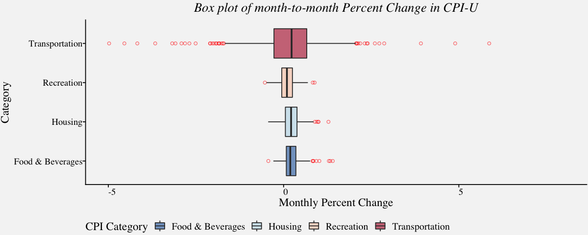
Although box plots are very popular, some information about the underlying distribution is lost. For example, one cannot find how values in the data are distributed (For instance, its not possible to know if data is bimodal or multimodal). Additionally, there are sophisticated alternatives to box plot these days and we discuss them in the next section.
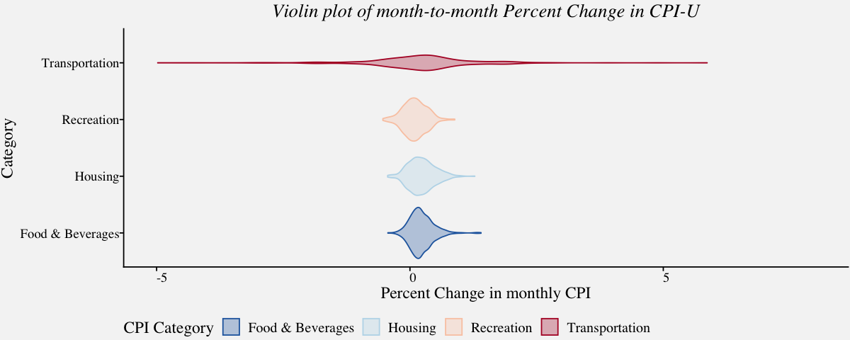
Violin plot
With Violin plots, it is easy to visualize overall data density as they display the density for all data points. A violin plot combines density plot with a box plot. Unlike box plots, the violin plot displays the density of all points than just the middle half. The best source of information I came across regarding this topic include a paper by Hadley Wickham and Lisa Stryjewski titled 40 years of boxplots and another from Jerry L. Hintze and Ray D. Nelson titled Violin Plots: A Box Plot-Density Trace Synergism.
# Violin plot of carrier delays of largest air carriers in the Unites States
cpi_violinplot <-
ggplot(data=cpi_pct,
       aes(x=cpi_pct$Category,y=cpi_pct$PercentChange,color=cpi_pct$Category,fill =cpi_pct$Category)) +
       ylim(-5,8) +
       labs(color="CPI Category",fill="CPI Category") +
       geom_violin(alpha=0.3) +
       theme_pprabhu() +
       ggtitle("Violin plot of month-to-month Percent Change in CPI-U") +
       labs(x="Category",y="Percent Change in monthly CPI") +
       scale_fill_manual(values = pprabhu_pal("div")(4)) +
       scale_color_manual(values = pprabhu_pal("div")(4)) +
       coord_flip() +
       theme(plot.title=element_text(hjust=0.5,face="italic"),
             axis.text.x = element_text(angle=0))

cpi_violinplot
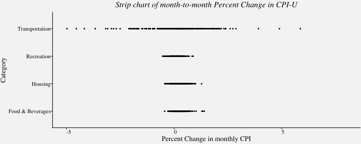
Strip Chart
A strip chart encodes each sample of a distribution as a dot and is a variant of the dot plot. They are excellent for visualizing small one-dimensional dataset. Although strip charts can reveal gaps, outliers, and data outside of the expected range, they are not a suitable approach if there is overlapping of points. In the example below, we visualize the monthly CPI using strip chart in the following code; We can observe that, the points are overlapping in the plot and one cannot identify underlying patterns. One solution to this problem is, to use the strip charts on the sample of data. A better alternative is, the jitter plot.
# Strip chart of carrier delays of largest air carriers in the Unites States
# Using geom_point()
cpi_stripchart <-
ggplot(data=cpi_pct,
       aes(cpi_pct$Category,cpi_pct$PercentChange)) +
       ylim(-5,8) +
       geom_point(size = 0.75) +
       theme_pprabhu() +
       ggtitle("Strip chart of month-to-month Percent Change in CPI-U") +
       labs(x="Category",y="Percent Change in monthly CPI") +
       coord_flip() +
       theme(plot.title=element_text(hjust=0.5,face="italic"),
             axis.text.x = element_text(angle=0))

cpi_stripchart
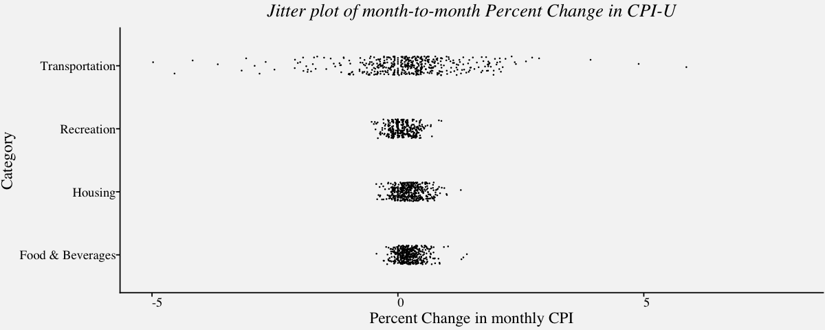
Jitter plot
In cases where the overlapping of points causes a reduction in the readability of the plot, we can use the jitter plot. Jitter plot introduces a small movement to the plotted points, making it easier to read and understand scatter plots. It is useful in identifying outliers and the normal behaviour or belt of the variable.
# Jitter plot(Strip chart with jitters) of carrier delays of largest air carriers in the Unites States
cpi_jitter <-
ggplot(data=cpi_pct,
       aes(cpi_pct$Category,cpi_pct$PercentChange)) +
       ylim(-5,8) +
       geom_point(position = position_jitter(width = .15, height = 0, seed = 320), size = 0.05) +
       theme_pprabhu() +
       ggtitle("Jitter plot of month-to-month Percent Change in CPI-U") +
       labs(x="Category",y="Percent Change in monthly CPI") +
       coord_flip() +
       theme(plot.title=element_text(hjust=0.5,face="italic"),
             axis.text.x = element_text(angle=0))

cpi_jitter
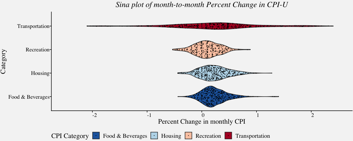
Sina plot
Sina plot is an enhanced jitter strip chart inspired by the jitter plot and the violin plot. They are useful in visualizing a single variable in a multiclass dataset. The width of the jitter is controlled by the density distribution of the data within each class.
# Sina plot of carrier delays of largest air carriers in the Unites States
cpi_sina <-
ggplot(data=cpi_pct,
       aes(x=cpi_pct$Category,y=cpi_pct$PercentChange,fill=cpi_pct$Category)) +
       ylim(-2.5,2.5) +
       geom_violin() +
       ggforce::geom_sina(size = 0.05) +
       theme_pprabhu() +
       ggtitle("Sina plot of month-to-month Percent Change in CPI-U") +
       labs(x="Category",y="Percent Change in monthly CPI",fill="CPI Category") +
       scale_color_manual(values = pprabhu_pal("div")(4)) +
       scale_fill_manual(values = pprabhu_pal("div")(4)) +
       coord_flip() +
       theme(plot.title=element_text(hjust=0.5,face="italic"),
             axis.text.x = element_text(angle=0))

cpi_sina
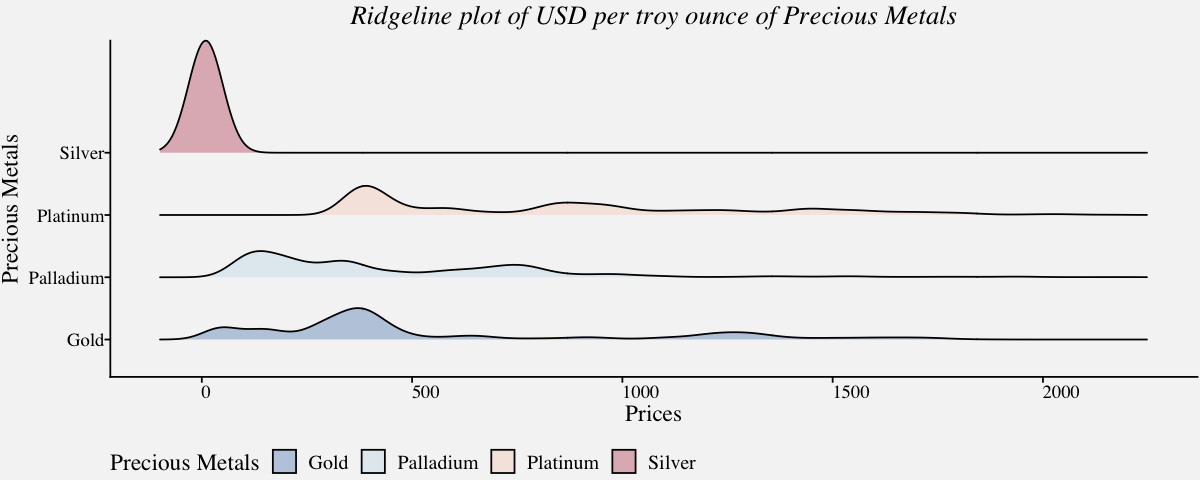
Ridgeline plot
Ridgeline plots, also called ridge plots or joy plots, are represented using histograms or density plots and are useful when a number of data segments have to be plotted on the same horizontal scale. Since they slightly overlap and create the impression of a mountain range, they are called ridgeline plots.
# Ridgeline plots to view price distribution of precious metals (1968-Present)
preciousmetals_ridgeline <-
ggplot(precious_metals,
       aes(x=precious_metals$USD,
           y=precious_metals$Commodity,
           fill = precious_metals$Commodity)) +
geom_density_ridges(bandwidth=40,color="black",alpha=0.3) +
xlim(-100,2250) +
labs(fill="Precious Metals") +
labs(x="Prices",y="Precious Metals") +
coord_cartesian(clip = "off") +
scale_fill_manual(values = pprabhu_pal("div")(4)) +
scale_color_manual(values = pprabhu_pal("div")(4)) +
theme_pprabhu() +
ggtitle("Ridgeline plot of USD per troy ounce of Precious Metals") +
theme(plot.title = element_text(hjust=0.5,face="italic"),
      axis.text.x = element_text(angle=0))

preciousmetals_ridgeline
The list of plots discussed above is by no means an exhaustive list, but it gives an idea of the range of plots available to visualize multiple univariate distributions in a single plot. That said, there are a number of variations of the plots discussed above. Variable-width box plots, notched box plots, beeswarm plots, violin scatterplots, violin strip charts, bean plots, waffle charts, barcode charts, jittered strip plots, boxen plots are some of them. If you are interested in reading more about these, please scan through the links mentioned in the Further Reading section.
Thanks for reading! As I mentioned in the beginning, there are a lot of cool visualization techniques available for visualizing distributions. To modify the visualizations with your own data, Click Colab Notebook to edit and run the workbook using Google Colab. If you want to get in touch with me, feel free to reach me on my email. You can also view the code in my Github repository .
Further Reading
(1) https://datavizproject.com
(2) https://datavizcatalogue.com
(3) https://www.data-to-viz.com/
(4) https://www.r-graph-gallery.com/
References
(1) Claus O. Wilke. 2019. Fundamentals of Data Visualization: A Primer on Making Informative and Compelling Figures.https://clauswilke.com/dataviz/
(2) Kieran Healy. Data Visualization : A Practical Introduction.
(3) Few, Stephen. Now You See It: Simple Visualization Techniques for Quantitative Analysis. Oakland, CA: Analytics Press, 2009.
(4) Nussbaumer Knaflic, Cole. Storytelling with Data: A Data Visualization Guide for Business Professionals. Hoboken, NJ: John Wiley and Sons, 2015.
(5) Iliinsky, Noah, and Julie Steele. Designing Data Visualizations. Sebastopol, CA: O’Reilly, 2011.
(6) Klanten, Robert, Sven Ehmann, and Floyd Schulze. Visual Storytelling: Inspiring a New Visual Language. Berlin, Germany: Gestalten, 2011.
(7) McCandless, David. The Visual Miscellaneum: A Colorful Guide to the World’s Most Consequential Trivia. New York, NY: Harper Design, 2012.
(8) Tufte, Edward. The Visual Display of Quantitative Information. Cheshire, CT: Graphics Press, 2001.
(9) Ware, Colin. Visual Thinking for Design. Burlington, MA: Morgan Kaufmann, 2008.
(10) Ware, Colin. Information Visualization: Perception for Design. San Francisco, CA: Morgan Kaufmann, 2004.
(11) Yau, Nathan. Visualize This: The FlowingData Guide to Design, Visualization, and Statistics. Indianapolis, IN: John Wiley & Sons, 2011.
(12) Hadley Wickham and Lisa Stryjewski. 40 years of boxplots. 2011. https://vita.had.co.nz/papers/boxplots.pdf